How many print colours is it possible to choose from? Here’s how to select them
How can I select the correct number of print colours to customize industrial double-sided tape?
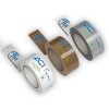
Unlike professional double-sided adhesive tape, designed to “disappear” between the two attached surfaces, packaging tape and the packages themselves create a separate surface, which can obviously be customized to create unique packaging, able to offer visibility and recognizability to the brand.
And while online tape customization is easy, thanks to our service, it can be more difficult to choose the actual graphics to print on it. What background colour should you use for your new branded double-sided tape?
What should you print on its surface: the company logo, only the brand name, or both? And again, how to select the correct number of print colours? The factors to consider in order to have the best answer are several.
Of course, it’s about finding the perfect colour combination for your business, thinking about the colours found in the rest of the packaging; but you must also consider the actual capabilities of printing presses, as well as the costs of multi-colour printing.
So, let’s have a look at how many print colours you can choose from, and how to select the perfect ones for your custom adhesive tape!
How many printing colours can you choose from?
Let’s start from purely technical data, i.e., the number of possible print colours for the customization of PVC, PPL, or reinforced paper packaging tape.
Well, given the printing technique we use, there is no real limit of usable colours: it’s about printing stereotypes made specifically for the customization of any given order. There is, therefore, no technical limit that must be taken into account.
How many colours are printed on custom adhesive tape on average?
To choose how many colours to use for the customization of your professional adhesive tape it can, therefore, be useful to know what other companies usually do.
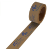
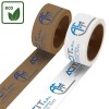
On average, most orders are completed with customizing one or two print colours at a time, but it must be noted that, sometimes, more complex requests are made as well, whose customization is processed with multiple colours.
Of course, as the required colours increase, the printing cost increases as well. It’s important to mention, however, that this cost is amortized on the amount of rolls of custom double-sided adhesive tape purchased: the use of more colours is, thus, usually a feature of larger orders.
In any case, our graphic designers are always ready to offer advice to customers who have some doubts, and to present, when necessary, ad-hoc solutions and printing ideas through graphics drafts created using the logo or colours provided by the client company as a base.
How to choose the right colours for your customized adhesive tape
Given the technical limitations of adhesive tape customization, let’s have a look at how to choose which and how many colours to use using your marketing strategy as a jump off point. Companies with a well-defined brand identity usually boast a precise colour palette used for their communication.
In the case of Ikea, for example, you will see the combination of blue and yellow, in the case of Coca Cola you will always find a combination of red with white or black, in the case of Fanta you cannot miss their orange, and so on. In these cases, the choice between the colours to be used is already made upstream.
Other times, the customization of the tape is done by a company that does not have a clear brand identity, or one which wishes to create exceptional customizations because of an event or a promotion initiative that moves away from their usual colour combination. In these cases, it will be best to think about the psychological associations which each colour brings with it in different cultures.
In the West, as we know very well, red reminds peoples of love, passion, and energy, whereas yellow is associated with energy, but also with intelligence and liveliness, while green inspires tranquillity, blue confidence, white purity, black elegance or mourning, and so on. We need to identify colours that are consistent with the brand message, as well as the needs of its audience.
Secondly, should you use more colours, it is best to think not only about the meaning of the individual shades, but also about the result of their combination. There are risky combinations, like red and pink, green and red, brown and black, and so on.